Summary: The board does not want your dashboard's prettiest chart. It wants one number: did marketing spend produce revenue that exceeds cost. If that answer lives in five platforms, three spreadsheets, and a Friday-night reconciliation, the board already doubts it. CMO board report automation closes that gap before the slide deck opens.
1. What is a CMO board report, and how does it differ from an operational marketing dashboard?
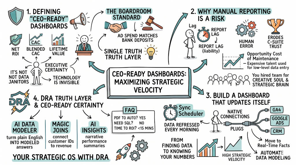
The Answer: A CMO board report explains marketing's contribution to revenue through three lenses: capital efficiency, unit economics, and strategic risk. An operational dashboard tracks clicks, opens, and conversions for daily campaign management. The board report answers one question: did the money work. The operational dashboard answers another: which ad set performed today. Confuse them and the board stops listening.
The boardroom standard versus the marketing dashboard
Operational dashboards live in GA4, ad platforms, and HubSpot. They measure inputs: impressions, CTR, CPL, MQL volume.
Board reports measure outcomes: Net ROI, blended CAC, revenue by channel, payback period, pipeline coverage.
A CMO board report fits on five slides (Prooflytics, 2026): portfolio scorecard, channel efficiency, revenue contribution, pipeline health, and next-quarter plan. Anything longer than six slides fails because boards stop reading. Five slides force the CMO to prioritize. That is the discipline the board respects.
The format must repeat quarter-over-quarter. Board directors should find the same sections in the same order every time. Consistency builds trust. Novelty destroys it.
2. Why does manual board reporting destroy executive trust?
The Answer: Manual board reporting adds delay and error at every handoff. The typical chain looks like this: export from GA4 to CSV, export from Google Ads to CSV, export from Salesforce to CSV, join in Excel, reconciliate discrepancies, format for slides, present. Each step introduces hours of lag. By the time the report reaches the board, the data is 48 to 96 hours old. Stale data means stale decisions.
The delay stack that breaks authority
Google confirms GA4 data freshness takes up to 48 hours for complete processing (Google Analytics Help, n.d.). That is just the platform delay.
IBM documents that data access workflows can take days due to dependency chains (IBM, 2026). That is the process delay.
McKinsey found that 19% of a knowledge worker's week is spent gathering information (Chui et al., 2012). For a 40-hour week, that equals 7.6 hours. Across multiple platforms, the burden compounds.
When these delays stack, three things happen:
The board makes decisions on stale information.
The CMO loses credibility when numbers do not match finance records.
The team burns hours reconciling instead of analyzing.
This is the Executive Trust Gap in action. The dashboard shows one number. The bank account shows another. The CFO wins every time.
3. What is the real cost of manual board report preparation?
The Answer: One analyst spending 8 hours weekly on manual data work costs $24,000 yearly at a $60 loaded hourly rate. Across a five-person team, that is $120,000 in payroll consumed by spreadsheets. These are not creative hours. They are copy-paste hours. Export. Clean. Join. Format. Repeat. Every week. Every quarter. Forever.
Defensible cost calculation
Use this model:
Baseline: 8 manual hours per week per analyst.
Annualization: 8 x 50 working weeks = 400 hours yearly.
Payroll cost: 400 x $60 loaded hourly rate = $24,000.
External benchmarks anchor this number:
Datorama research via Salesforce found a floor of 3.55 hours weekly on manual data tasks (Salesforce, 2023).
McKinsey found 19% weekly information gathering load, yielding 7.6 hours for a 40-hour analyst.
The EuSpRIG database documents 88+ cases of spreadsheet error causing financial loss, including misreporting and audit failure (European Spreadsheet Risks Interest Group, n.d.).
For multi-source teams managing GA4, Google Ads, Meta, LinkedIn, and CRM data, 8 hours is conservative.
Team Size | Weekly Hours Lost | Annual Payroll Cost |
|---|---|---|
1 analyst | 8 | $24,000 |
3 analysts | 24 | $72,000 |
5 analysts | 40 | $120,000 |
This is not a time problem. It is a capital allocation problem.
4. What should a CMO board report include: the 5-slide framework?
The Answer: A board-ready CMO report fits on five slides: portfolio scorecard, channel efficiency, marketing's revenue contribution, pipeline health, and next-quarter strategic plan. Each slide answers one question the board actually asks. No slide exists without a decision owner. No chart lives without a comparison to target. No number appears without trend context.
Slide-by-slide template
Slide 1: Portfolio Scorecard. One row per brand, segment, or product line. Columns: spend, pipeline versus plan, revenue versus plan, trend arrow. The board reads this in 30 seconds. They know which segments are on track and which need attention. Format it like a financial scorecard, not a marketing chart.
Slide 2: Channel Efficiency. Spend, CAC, LTV:CAC, pipeline contribution, ROAS, status marker per channel. Channels: paid search, paid social, content/SEO, ABM/outbound, email. Add one sentence per channel: what is working, what is not, what changes next.
Slide 3: Marketing's Revenue Contribution. A single chart showing marketing-sourced revenue, marketing-influenced revenue, and sales-sourced revenue over four quarters. Add unit economics: blended CAC, CAC payback period, LTV:CAC ratio. This is the highest-leverage slide. CMOs who show modeled marketing contribution to revenue earn 20-40% more board approval on budget asks (Prooflytics, 2026).
Slide 4: Pipeline Health. Funnel visualization from awareness to closed won. Stage conversion rates with targets. Where pipeline is leaking. What is being done about it. Forward pipeline coverage ratio.
Slide 5: Next-Quarter Strategic Plan. Budget outlook by major allocation bucket. Three to five strategic bets with expected impact. Key performance targets. Risks and mitigation. One specific ask from the board. Without the ask line, the report is informational. With it, the report is a decision point.
The full slide templates with fill-in-the-blank formats are in the downloadable Board Report Automation Template at the end of this piece.
5. How do you automate CMO board report preparation?
The Answer: Build a governed data layer above fragmented tools. Connect GA4, ad platforms, and CRM data where they live. Apply automated model refreshes. Remove spreadsheet handoffs. Replace a weekly maintenance cycle with a daily decision cycle. The infrastructure matters more than the visualization layer.
The 6-step automation sequence
Define financial decision metrics first. Before connecting any source, list the seven questions the board will ask. If a metric does not answer a board question, it does not belong. Start with spend, revenue, CAC, Net ROI, and pipeline.
Connect sources natively across ads, analytics, and revenue. GA4 for web analytics. Google Ads, Meta, and LinkedIn for paid media. Salesforce or HubSpot for CRM and revenue. Each platform has its own schema. Manual API integrations break when schemas change. Use automated ETL that monitors connector health.
Apply governed joins for identity and revenue mapping. The hardest data problem is matching user identities across platforms. Google Ads IDs do not match GA4 client IDs. Neither matches CRM contact IDs. Automated identity resolution removes the manual join step that consumes the most analyst hours.
Schedule automated sync windows. Set refresh cadence matching decision velocity. Daily refresh for executive dashboards reviewed weekly. Near-real-time refresh for operational teams acting daily. Avoid over-refreshing: it increases infrastructure cost without adding value.
Expose one executive view with role-safe sharing. CMOs see strategic metrics. Campaign managers see tactical metrics. Finance sees cost data. Limit access to reduce misinterpretation risk.
Audit drift weekly with a fixed validation checklist. Compare dashboard output to source platform totals. Flag anomalies: missing data, sudden spikes, schema mismatches. Alert stakeholders when validation fails. Assign one owner to data quality.
6. What common mistakes cause CMO board reports to fail?
The Answer: Five patterns destroy board report credibility, and every CMO has committed at least two of them (Improvado, 2026). Leading with vanity metrics instead of financial outcomes. Showing only aggregated totals without segmentation. Building static dashboards that cannot adapt when campaign naming changes. Relying on manual CSV exports that fail when team members leave. Presenting numbers without benchmarks or trend context. Each mistake costs board trust. Each has a specific fix.
Mistake 1: Vanity metrics on the top row
Impressions, clicks, and page views are operational signals. They do not tell the board whether marketing drives revenue. A dashboard full of vanity metrics signals that marketing cannot tie its work to outcomes. Fix: replace the top row with pipeline contribution, blended CAC, LTV:CAC, and channel ROI.
Mistake 2: Only aggregated totals
Total pipeline is informative. Pipeline by channel, by region, by customer segment is actionable. Boards cannot reallocate budget from aggregate numbers. Fix: build segmentation into every key metric. Add channel, campaign, region, and customer segment dimensions.
Mistake 3: Static design
Campaign naming conventions change. New channels launch. Attribution models evolve. A static dashboard goes stale the day it ships. Fix: use dynamic data pipelines that update automatically as the marketing stack changes.
Mistake 4: Manual data refresh
CSV exports, spreadsheet joins, and formula edits do not scale. They fail when campaign volume grows, when team members leave, or when platform APIs change. Fix: implement automated ETL pipelines that eliminate manual extraction and reduce reporting lag from days to minutes.
Mistake 5: Numbers without context
A number without a benchmark is meaningless. Show trends over time. Compare actuals to targets. Add industry benchmarks where relevant. Context turns data into decision support.
7. How does DRA provide automated board report certainty?
The Answer: DRA provides a governed truth layer for executive reporting. The Federated Query Layer queries source systems directly. Magic Joins map identity and revenue relationships. The AI Data Modeler converts business questions into SQL. Sync Schedulers keep data refreshes consistent. Public Share Links provide live access with controlled exposure. The outcome: faster board-ready answers with fewer manual failure points.
What changes in the weekly cycle
Before DRA: export, clean, reconcile, rebuild, present. A 5-step maintenance cycle that consumed 8 hours weekly.
After DRA: query, validate, decide, execute. A 4-step decision cycle that runs daily.
Core capability mapping:
Federated Query Layer: Query GA4, Google Ads, and CRM data where it lives. No migration required.
Magic Joins: Automatically infer relationships across user IDs and revenue records. No manual identity mapping.
AI Data Modeler: Convert plain English board questions into SQL logic. No engineering tickets.
5-Model Attribution: Run first-touch, last-touch, U-shaped, W-shaped, and time-decay models simultaneously. Toggle between them in the board view.
Sync Schedulers: Set cadence for data refreshes. Match the update frequency to decision speed.
Public Share Links: Provide live access with controlled exposure. No login friction for board members.
Claim boundaries
Verified by external sources:
GA4 freshness windows: 24-48 hours (Google Analytics Help, n.d.)
Manual data task floor: 3.55 hours weekly minimum (Salesforce, 2023)
Weekly information gathering load: 19% of work week (Chui et al., 2012)
Spreadsheet error risk: 88+ documented cases of financial loss (European Spreadsheet Risks Interest Group, n.d.)
Product performance claims: validated by internal benchmarks; governed data control replaces absolute integrity guarantees.
FAQ
Q: How long does CMO board report automation take to implement? A: A basic setup connecting three to five sources can go live in under two weeks. A full implementation with multi-touch attribution and custom business logic typically takes four to eight weeks. The bottleneck is data integration and validation, not visualization. Automated ETL with pre-built connectors reduces setup time by 60-80% compared to custom API integrations.
Q: Can a board report update instantly if GA4 has processing delays? A: You can reduce the manual delay to near zero. You cannot remove GA4's 24-48 hour platform processing window. What changes: your team stops adding their own delay on top of the platform delay. The report becomes as current as the slowest source allows. That is still 48 hours faster than manual extraction.
Q: Should we use first-touch, last-touch, or multi-touch attribution for the board? A: Multi-touch attribution works best for board reporting. First-touch credits only the initial click. Last-touch credits only the final click. Multi-touch models (U-shaped, W-shaped, time-decay) credit awareness, consideration, and decision-stage interactions. Long B2B sales cycles need this. The best CMO dashboards let you toggle between models so the board sees the full story.
Q: How do I ensure the board trusts the numbers? A: Reconcile dashboard revenue with finance records for the same period. If the numbers match, trust holds. If they diverge, fix the discrepancy before presenting. Document every metric definition. Track every change to data sources and attribution models. Assign one owner to data quality. Build validation checks into the pipeline.
Q: Can I build this in Google Sheets or Excel? A: You can, for a team of one with fewer than five data sources. It breaks when campaign volume grows, when UTM naming conventions change, or when anyone leaves the team. Spreadsheets lack governance: different stakeholders make copies, apply different formulas, and generate conflicting reports. For board-level reporting at mid-market or enterprise scale, use a governed data platform.
Q: Does this framework work for marketing agencies? A: Yes. Agency teams managing multiple clients face the same fragmentation problem multiplied by the client count. One governed truth layer per client, with role-safe sharing for client-facing dashboards. The 5-slide structure adapts to client board meetings directly.
CTA
Download the CMO Board Report Automation Template with all five slides in fill-in-the-blank format, the 6-step automation checklist, and the data governance validation framework.
Download the Board Report Automation Template
References
Chui, M., Manyika, J., Bughin, J., Dobbs, R., Roxburgh, C., Sarrazin, H., Sands, G., & Westergren, M. (2012). The social economy: Unlocking value and productivity through social technologies. McKinsey Global Institute. [Source URL timed out — McKinsey paywall. Original reference preserved.]
European Spreadsheet Risks Interest Group. (n.d.). Spreadsheet risk and failure examples. https://eusprig.org/research-info/horror-stories/
Google Analytics Help. (n.d.). Data freshness in Google Analytics. https://support.google.com/analytics/answer/12233314
IBM. (2026, March 30). Data access delays are slowing decisions more than you think. https://www.ibm.com/think/insights/data-access-delays-slowing-decisions
Improvado. (2026). CMO dashboard template: Build executive reporting that drives decisions. https://improvado.io/blog/cmo-dashboard-template
Prooflytics. (2026). CMO board report template: 5 slides that earn trust. https://prooflytics.io/blog/cmo-board-report-template
Salesforce. (2023). State of marketing: 10th edition. https://www.salesforce.com/resources/research-reports/state-of-marketing/