Summary: Most marketing dashboards report vanity metrics that look impressive but disconnect from real business outcomes. This creates a trust gap between CMOs and their CEOs. The article identifies five specific metrics to kill — email open rates, social impressions, page views, MQL volume, and vague engagement scores — and replaces each with a revenue-linked alternative. It explains why platforms like GA4 create a 24-to-48-hour reporting lag that forces teams into manual data work. It introduces modeled metrics — account engagement velocity, pipeline influenced, marketing-attributed revenue, and coverage-to-close ratio — that match spend to revenue. A five-step tactical action plan gives CMOs a path to bring financial-grade numbers to their next board meeting.
Your CEO does not trust your dashboard. They watch the bank account. When the charts show green arrows and the deposits are flat, the gap is not a data problem. It is a trust problem. You need financial-grade numbers that match the bank account (Gartner, 2025) — not charts that impress the room. Here is how to stop being a technical translator and start leading with modeled facts.
1. What is the "Pretty Picture" problem in marketing analytics?
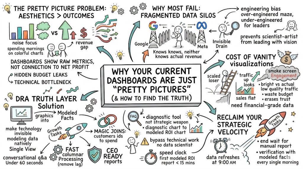
The Answer: The pretty picture problem occurs when your dashboard shows beautiful charts disconnected from net profit. You report clicks, impressions, and engagement. Your CEO sees spending with no matching deposit. The gap erodes trust.
The Metrics You Need to Kill
Your dashboard is full of numbers that look good but mean nothing. Kill these first:
Email open rates. One open from a CFO matters more than 1,000 opens from unqualified contacts.
Social media impressions. Impressions do not drive pipeline. Track actions after the view.
Page views with high bounce. Traffic without context tells you nothing.
MQL volume. Marketing-qualified leads that never convert are a billable activity, not a business outcome.
"Engagement" scores. What does engagement mean if no one buys?
For every metric you stop tracking, replace it with one that answers: "Did we move revenue?"
Kill This | Track This Instead |
|---|---|
Email open rate | Account engagement velocity |
Social impressions | Pipeline influenced by channel |
Page views | Conversion rate by source |
MQL volume | Marketing-attributed revenue |
"Engagement" | Deal progression rate |
The Cost of Acting on Vanity Visualizations
A campaign shows a 300% traffic spike. The chart is bright and rising. But the traffic is low quality and your sales stay flat. You scale the campaign based on the chart. You burn budget on a loser.
This is the cost of the executive trust gap (Pillar 1 of the CMO Crisis) (Gartner, 2025). Your CEO sees the spend. They do not see the return. The gap grows with every meeting where the chart does not match the bank account.
2. Why do most dashboards fail to provide actual answers?
The Answer: Dashboards fail because platforms referee themselves. Google knows Google. Meta knows Meta. Neither knows your revenue. Your team spends hours manually stitching spreadsheets together. That manual labor is the invisible drain (Pillar 5 of the CMO Crisis) — 400 hours a year wasted on data maintenance instead of strategy (Moorman, 2024).
The Engineering Bias
Most tools are built for engineers, not leaders. GA4 is the villain here. It delivers a 24-to-48-hour report lag (Google, n.d.). It forces you to act as IT support for broken dashboards. You hired your team for their strategic brain. They spend mornings building bar charts.
This is the strategic velocity gap (Pillar 2). Your competitors pivot at machine speed. You wait for data.
3. How do you find the truth in your marketing data?
The Answer: Stop looking at raw metrics. Start modeling them into business outcomes. Net profit. Blended CAC. Incremental lift. These are the numbers your CEO trusts because they match the bank account.
What to Track Instead
Account Engagement Velocity: How fast do accounts move from first touch to meaningful action? If engagement is slow, your messaging misses the mark.
Pipeline Influenced: Which marketing touchpoints preceded deal creation? Do not count only direct-sourced opportunities. Track the full influence path.
Marketing-Attributed Revenue: How much revenue did marketing actually drive? Not clicks. Not leads. Revenue.
Coverage-to-Close Ratio: How many engaged accounts convert to pipeline? A healthy ratio is 1:4 to 1:6 (HumanR, 2026). If the ratio is worse, your qualification or messaging is broken.
A Real Example
A B2B SaaS company had 14 charts showing traffic up 40%. Revenue was flat. Their dashboard reported "engagement" but the CFO could not reconcile spend to deposits. After switching to modeled metrics — pipeline influenced, marketing-attributed revenue, and engagement velocity — they found that 80% of their "high-engagement" traffic came from the wrong segment. They redirected spend. Revenue moved in 60 days.
4. How does the DRA Truth Layer turn graphics into growth?
The Answer: DRA models your data where it lives. Our Federated Query Layer joins GA4, Google Ads, and SQL databases into a single view automatically. The AI Data Modeler turns plain English questions into modeled answers. You stop reporting raw clicks. You know your numbers in 60 seconds.
How the Executive Trust Gap Closes
Magic Joins: DRA connects customer IDs to spend automatically. No manual stitching.
5-Model Attribution: Run First-Touch, Last-Touch, Linear, Time-Decay, and U-Shaped models simultaneously. See the full picture.
CEO-Ready Reports: Walk into your board meeting with numbers that match the bank account.
The technology is invisible. The outcome is undeniable.
Tactical Action Plan
Audit your current dashboard. List every metric. Mark each one as "actionable" or "vanity."
Kill five vanity metrics this week. Replace them with the replacements in the table above.
Set a reporting cadence. Review engagement weekly, pipeline monthly, revenue impact quarterly.
Connect one metric to spend. Pick one campaign. Trace the dollar from spend to revenue. Prove the link.
Bring one modeled report to your next board meeting. Not charts. Facts.
FAQ
Q: My CEO loves the pretty dashboard. How do I sell the change? A: Show them one report that matches spend to revenue. The trust gap closes when the numbers match.
Q: How long does it take to switch metrics? A: Most teams see their first modeled report in under 15 minutes with DRA. The framework change takes one week.
Q: Won't my team resist losing their favorite charts? A: Yes. But your team did not join marketing to build bar charts. They joined to grow the brand. Kill the charts. Restore the strategy.
Q: Can you over-correct and measure too much? A: Yes. Not everything that matters can be measured. Brand trust, creative risk, and category creation do not fit in a dashboard. Track what drives revenue. Lead the rest on instinct.
Q: What if my data is spread across 10 platforms? A: That is the MarTech Stack Mess (Pillar 4). DRA joins fragmented data where it lives. You do not need to migrate anything.
CTA
Show your CEO a report that matches the bank account. Start your DRA plan and bring modeled facts to your next board meeting.
References
Gartner. (2025). Maximize ROI with marketing technology (martech). Gartner. https://www.gartner.com/en/marketing/topics/marketing-technology
Google. (n.d.). GA4 data freshness. Google Analytics Help. https://support.google.com/analytics/answer/11198161?hl=en
HumanR. (2026). Pipeline coverage ratio benchmarks: 3x vs 4x vs 5x by stage. HumanR. https://www.humanr.ai/intelligence/pipeline-coverage-ratio-benchmarks-3x-vs-4x-vs-5x
Moorman, C. (2024). The CMO Survey: Marketers spend on new technologies as they battle usage and impact challenges. Duke University Fuqua School of Business. https://www.fuqua.duke.edu/duke-fuqua-insights/cmo-survey-marketers-spend-new-technologies-they-battle-usage-and-impact